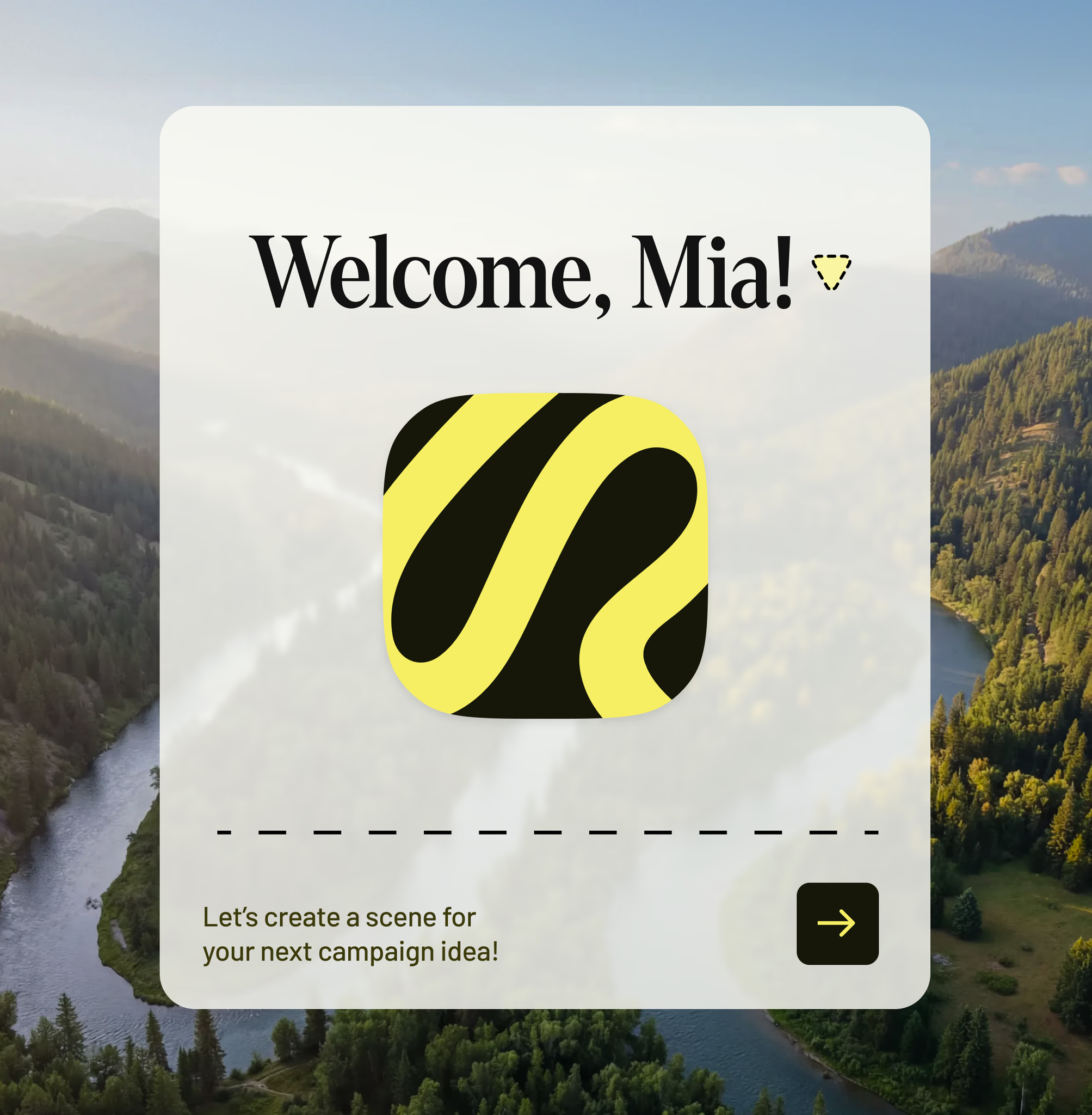
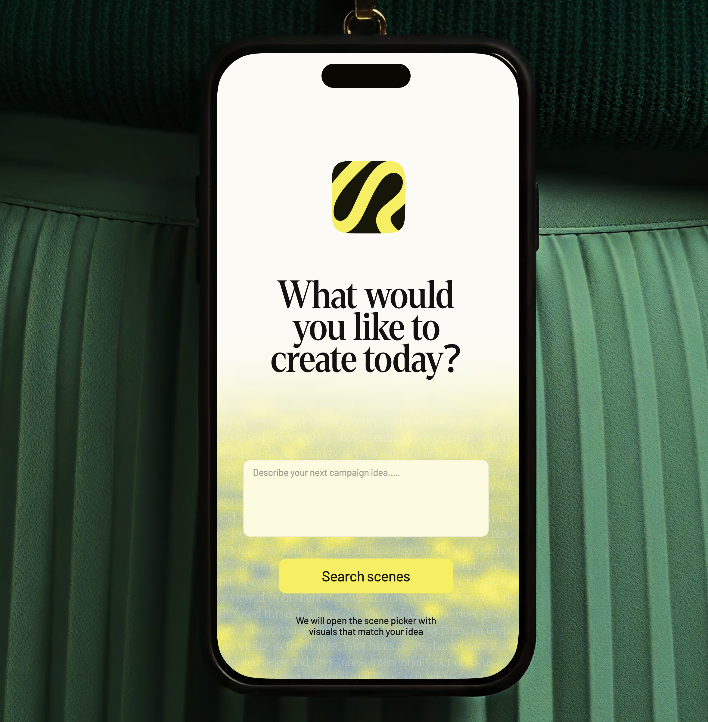
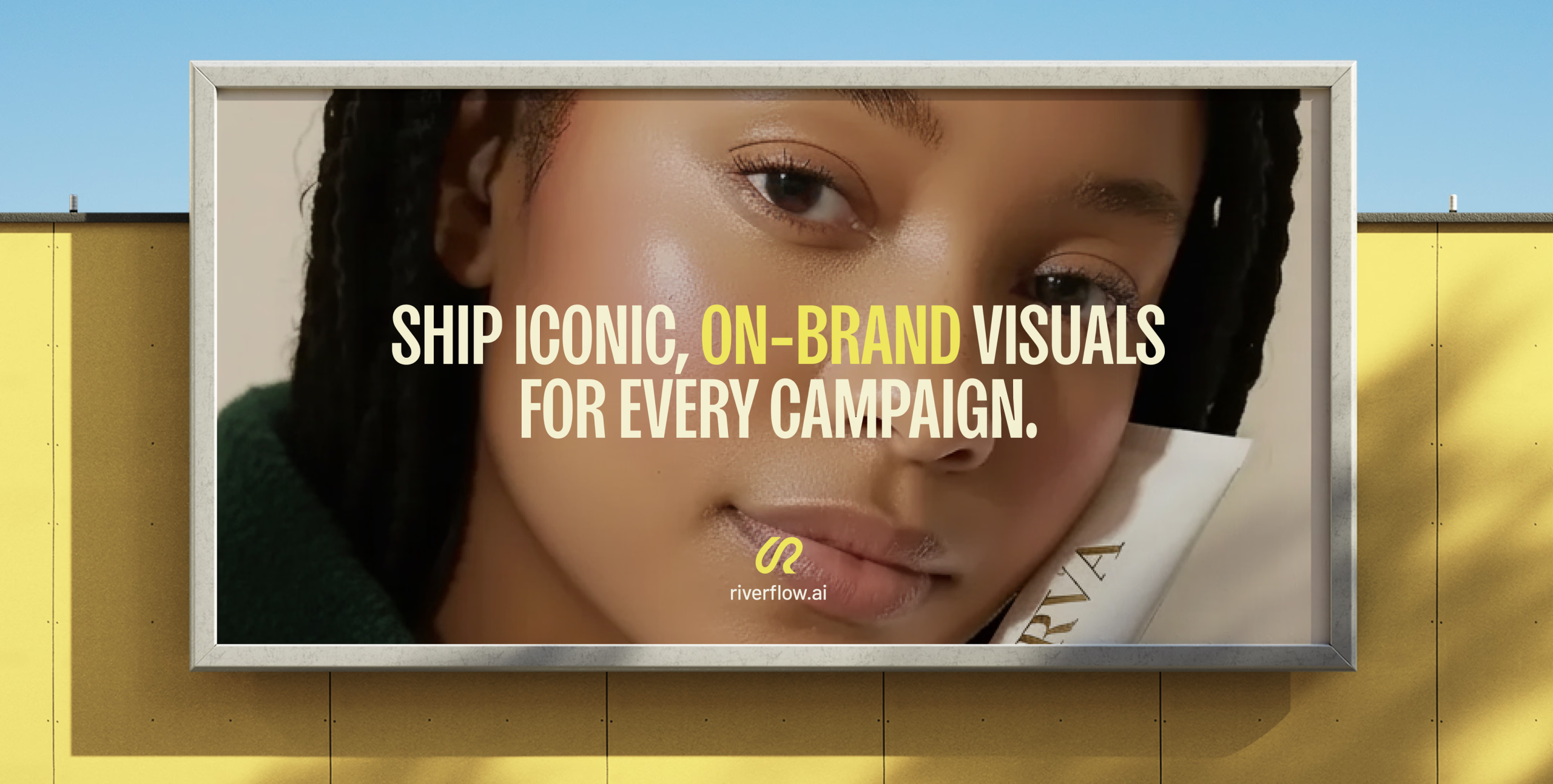
I was brought in by Nonstop to work on not only the logotype but to support the team in building the visual identity for Riverflow — a startup that uses AI to help brand and design teams generate on-brand visuals that actually match their existing standards. They needed the brand to feel less like a developer tool and more like a creative engine.
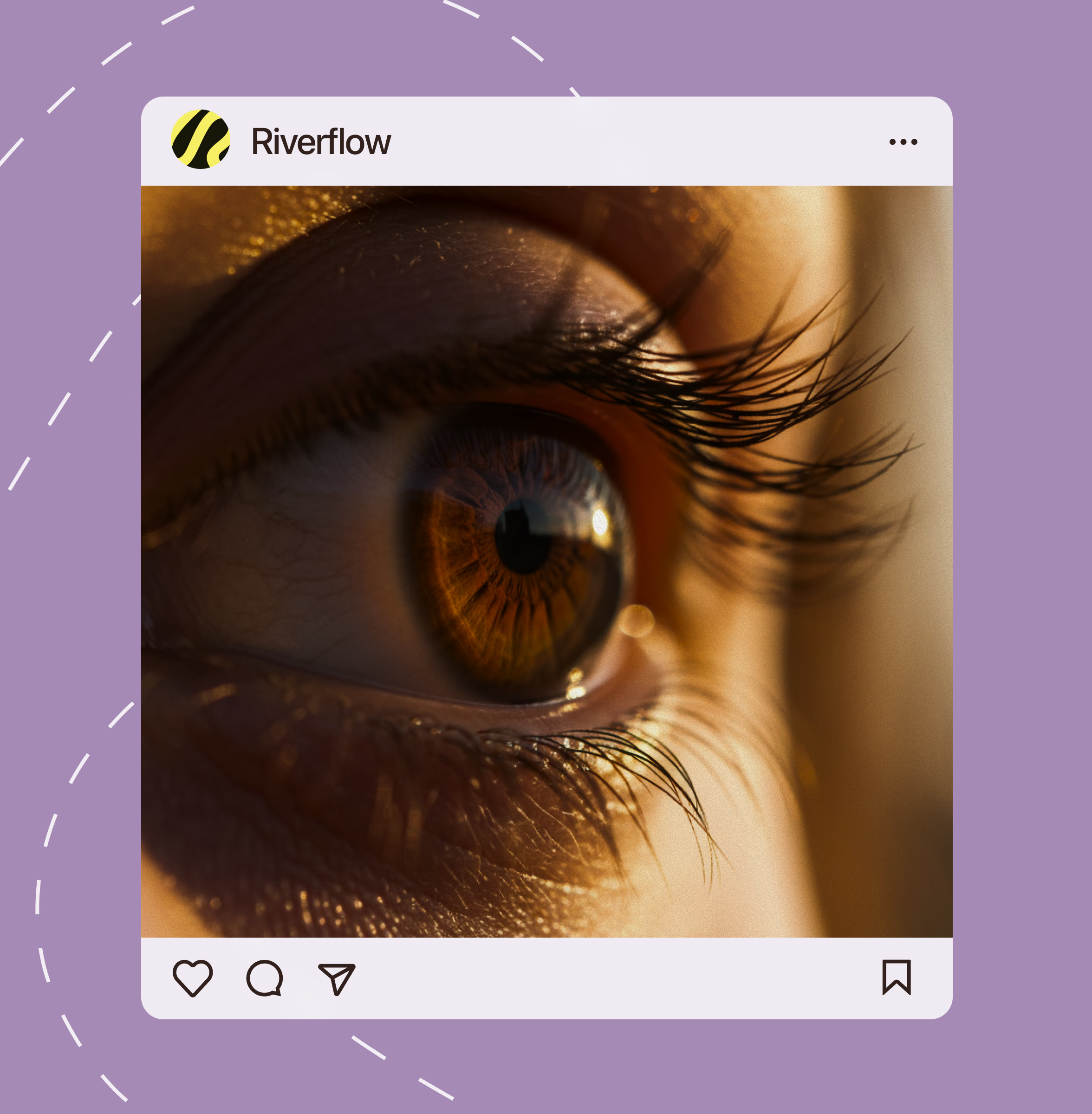
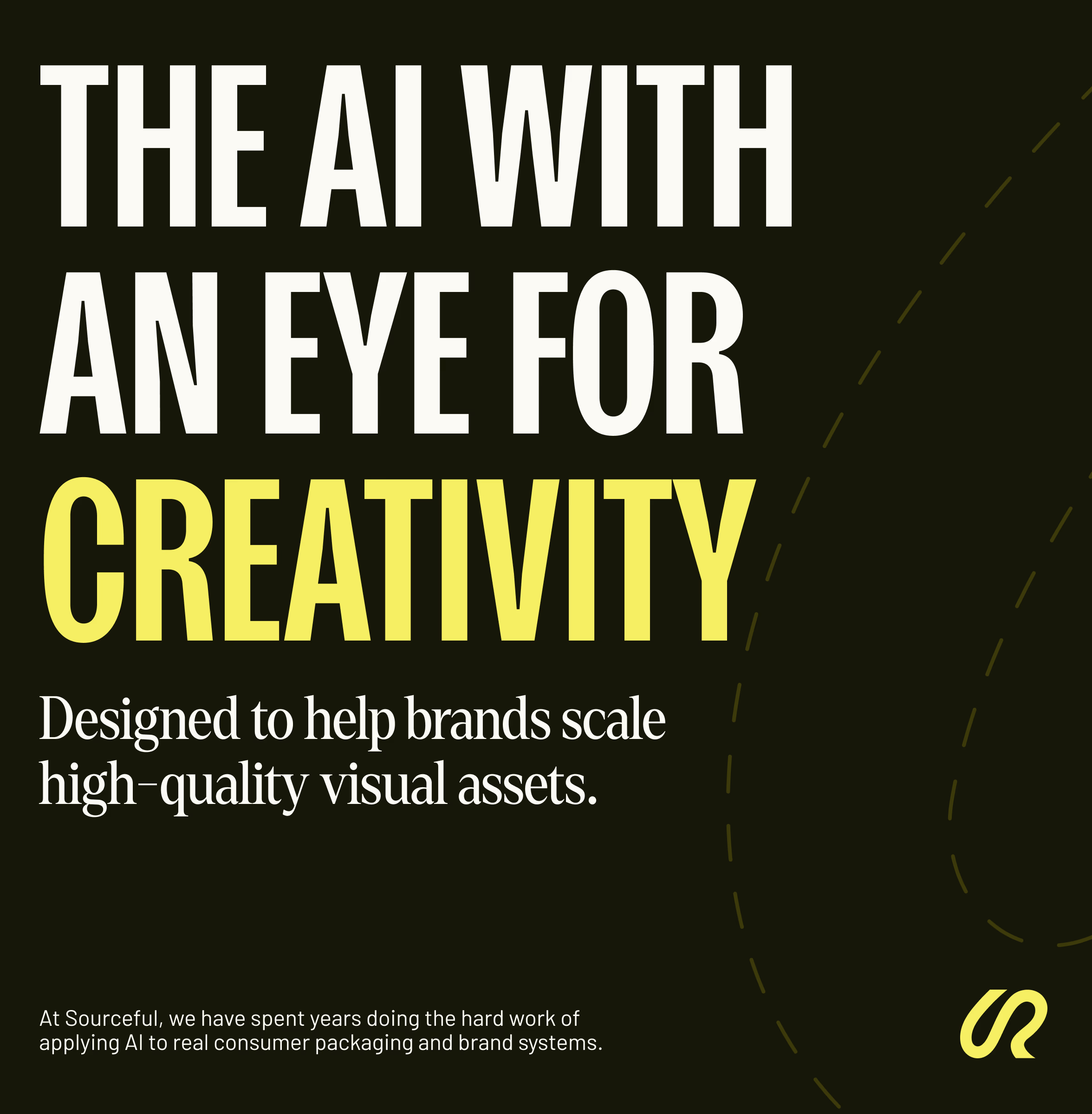
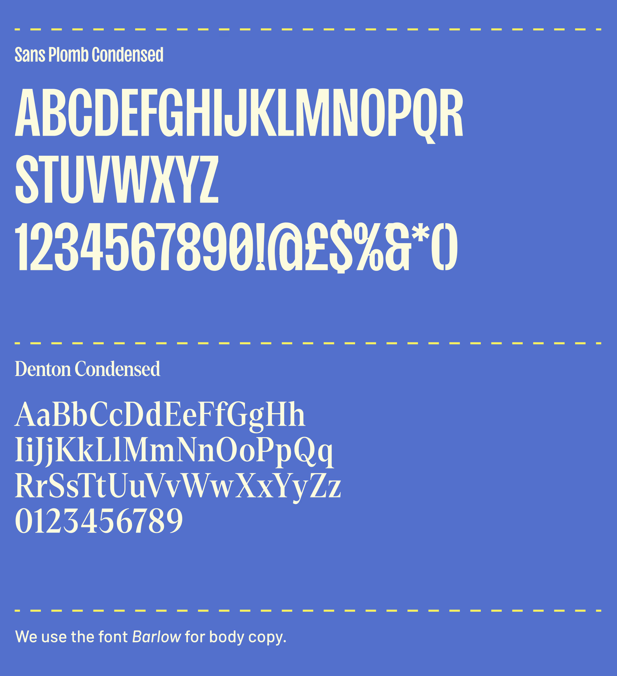
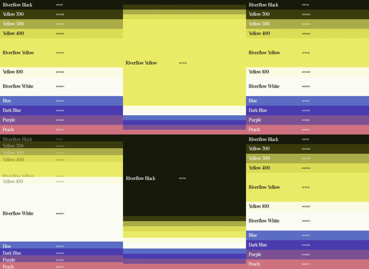
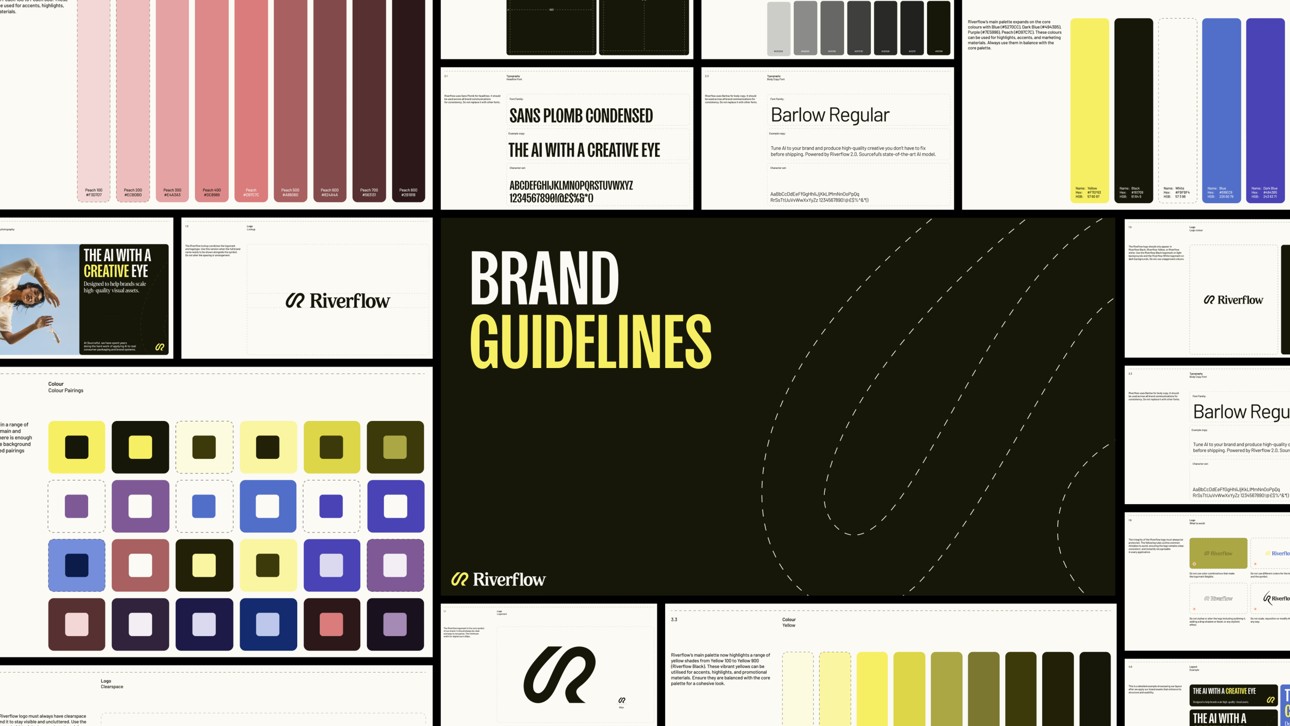
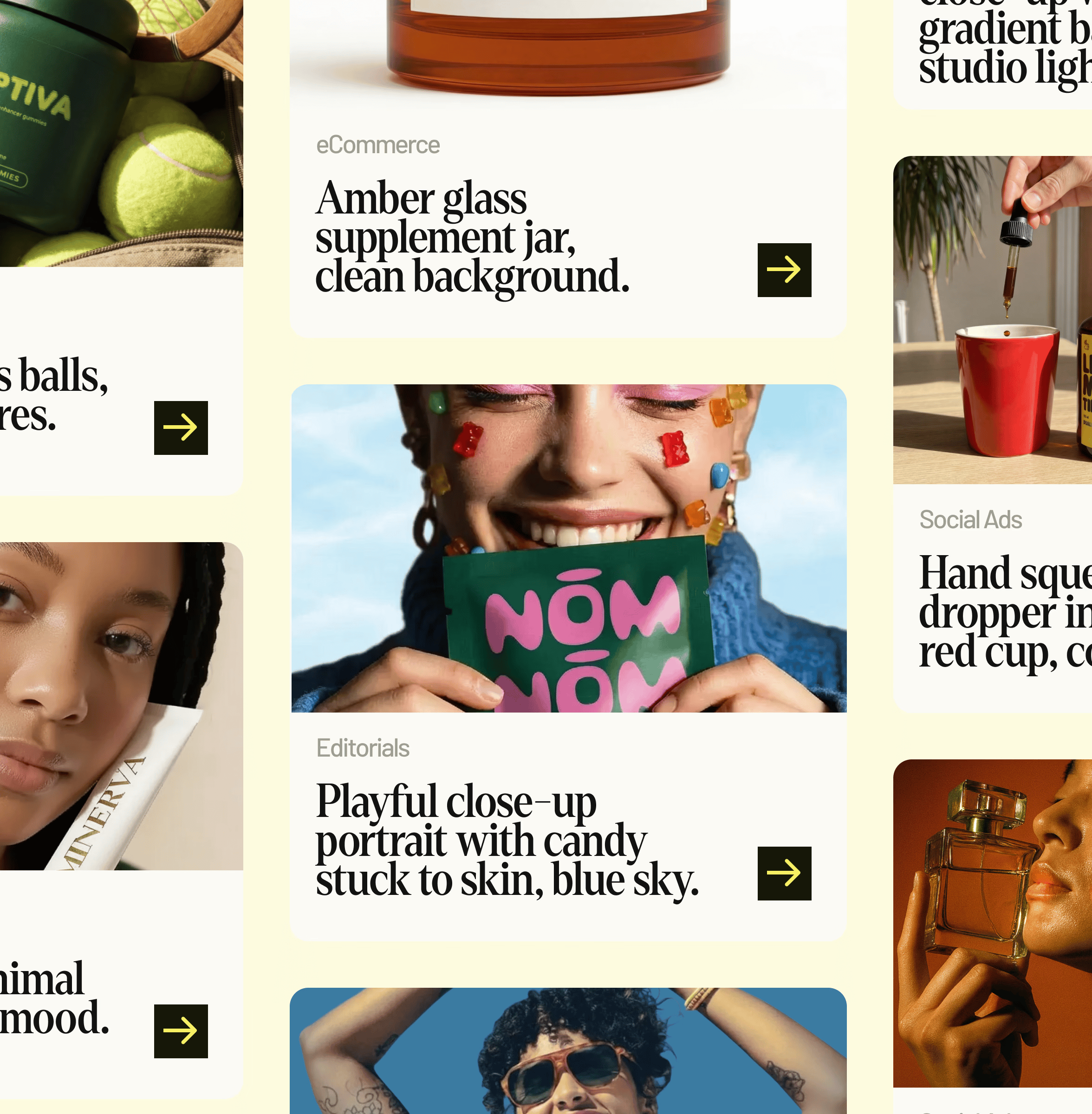
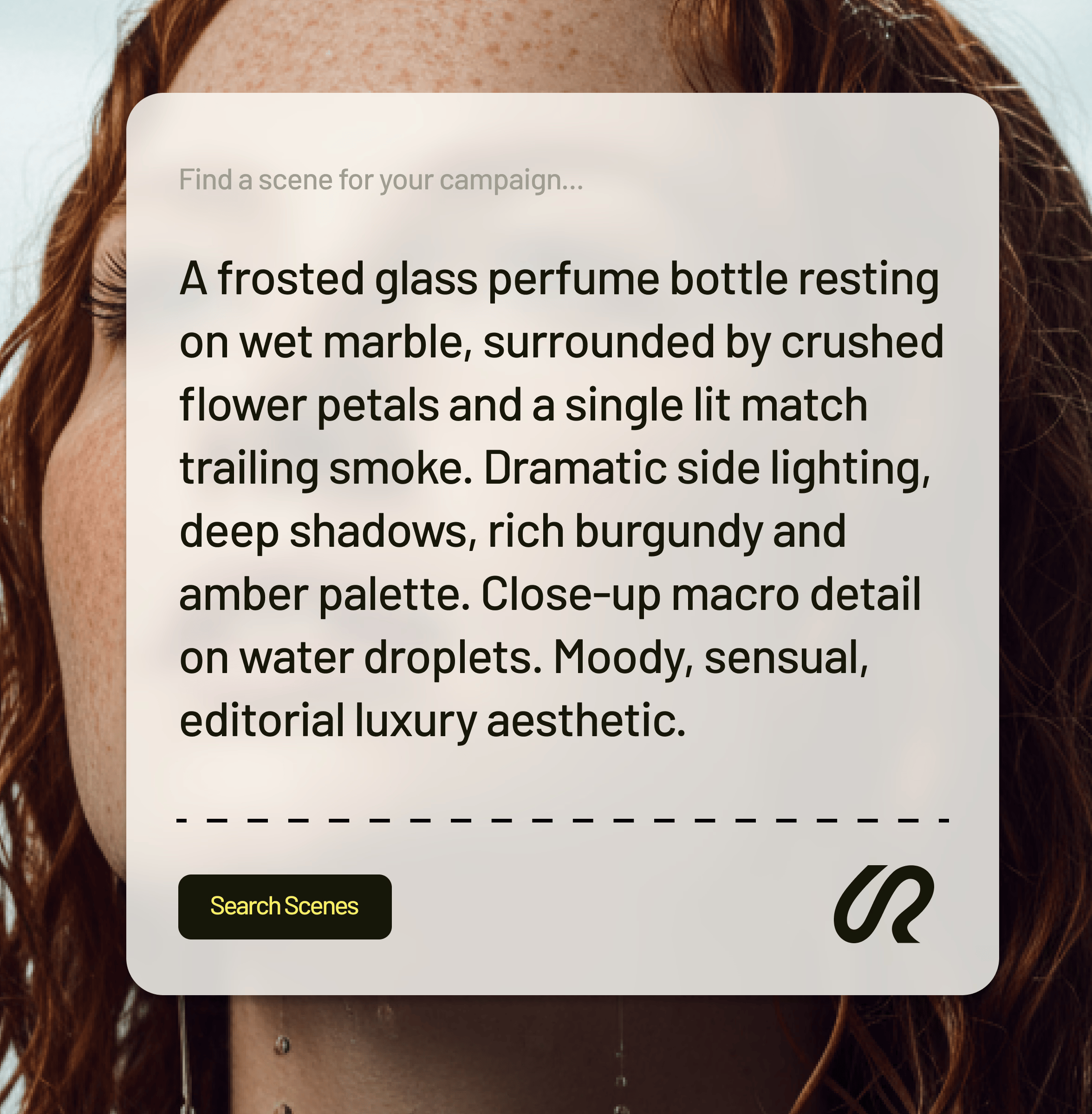
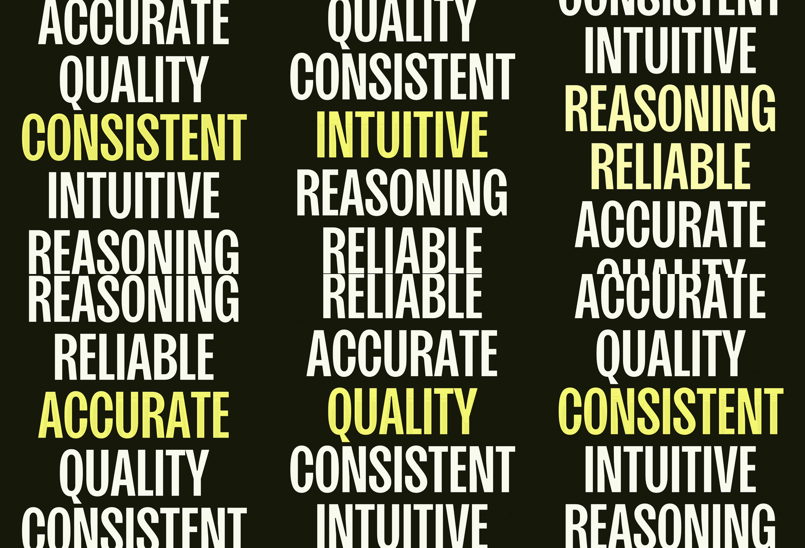
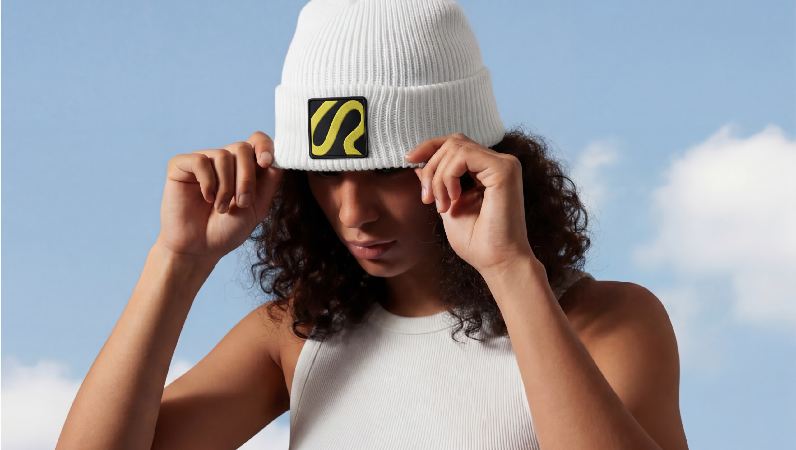
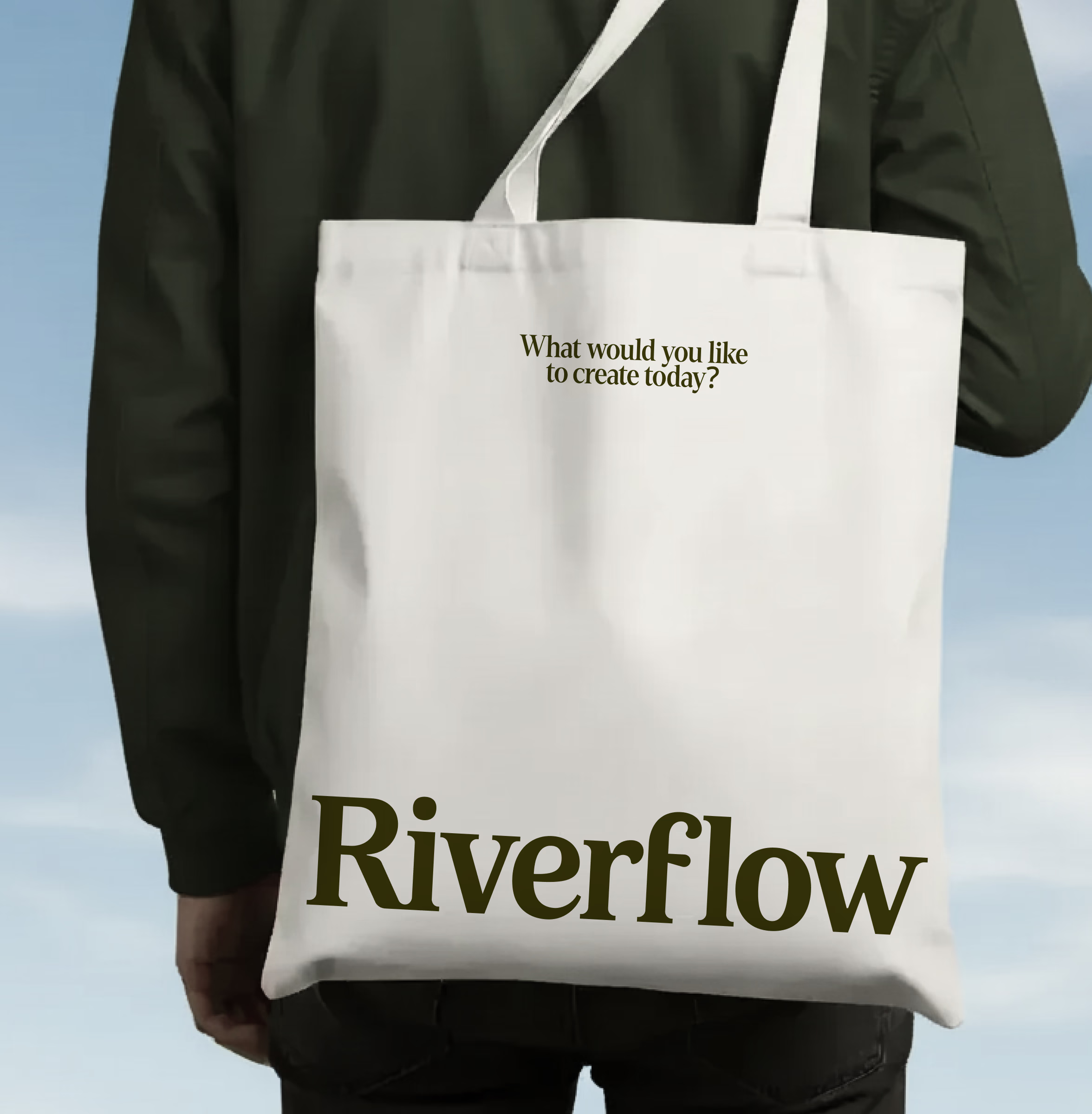
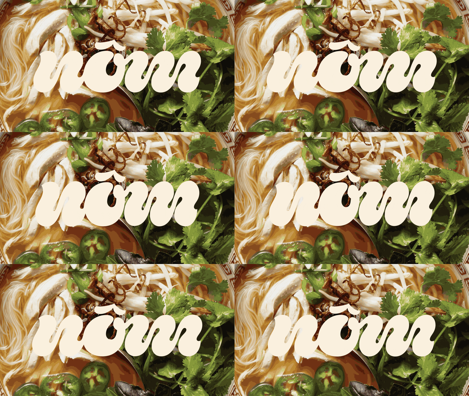
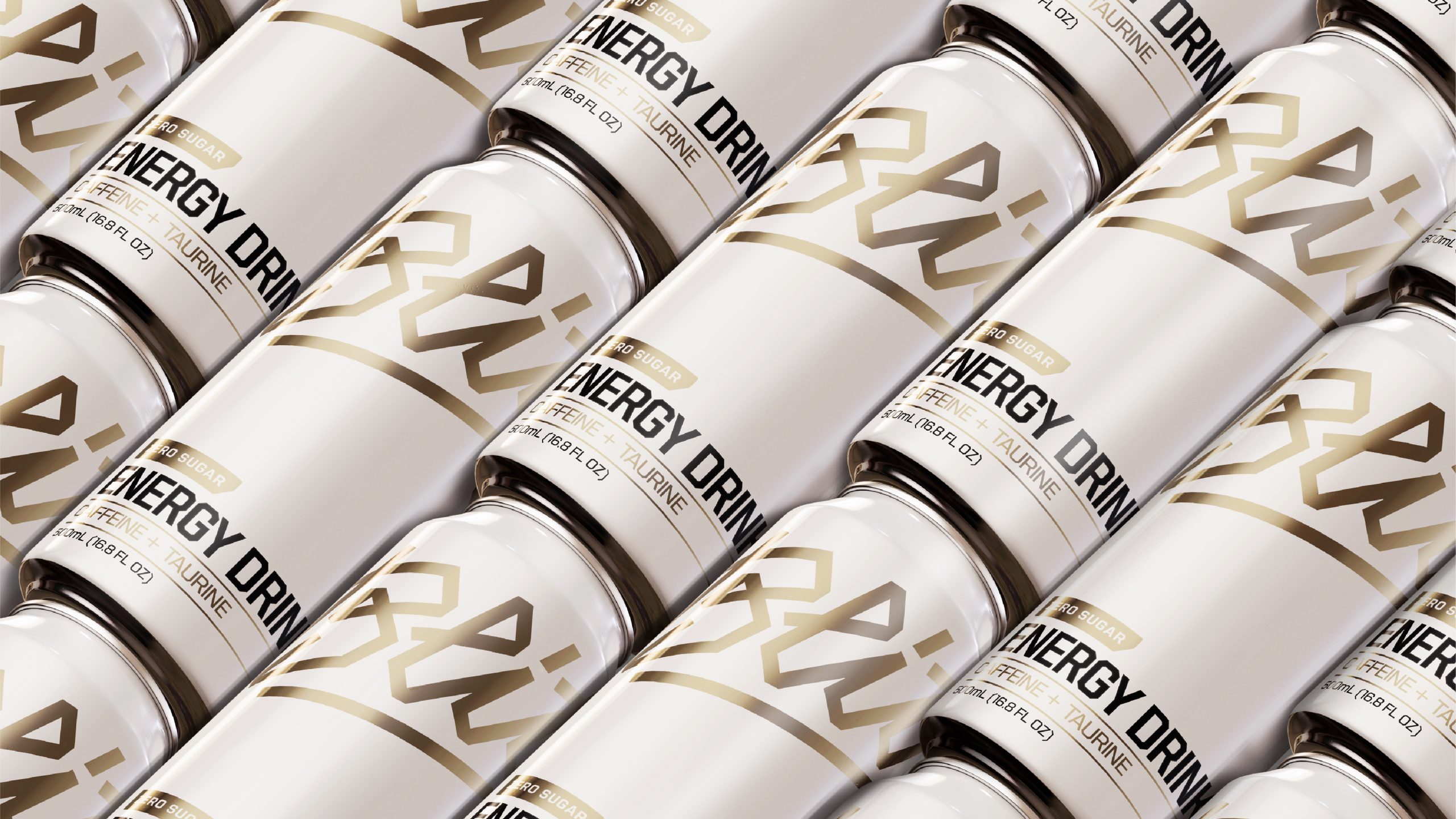
In order to meet that goal, we suggested a custom serif logotype to humanize the brand and help them stand out from a sea of sterilized, dark, and tech-heavy AI branding. The wordmark features soft terminals, counters and crossbars to reflect the idea behind the brand: making visuals that flow naturally with your brand. From there, we developed a system rooted in editorial typography, campaign-grade imagery, and a confident yellow-led palette, positioning Riverflow closer to fashion and beauty than a developer tool. Each module reads like a mini campaign case study, with bold headlines and tight copy explaining how Riverflow powers social, product, and brand visuals.
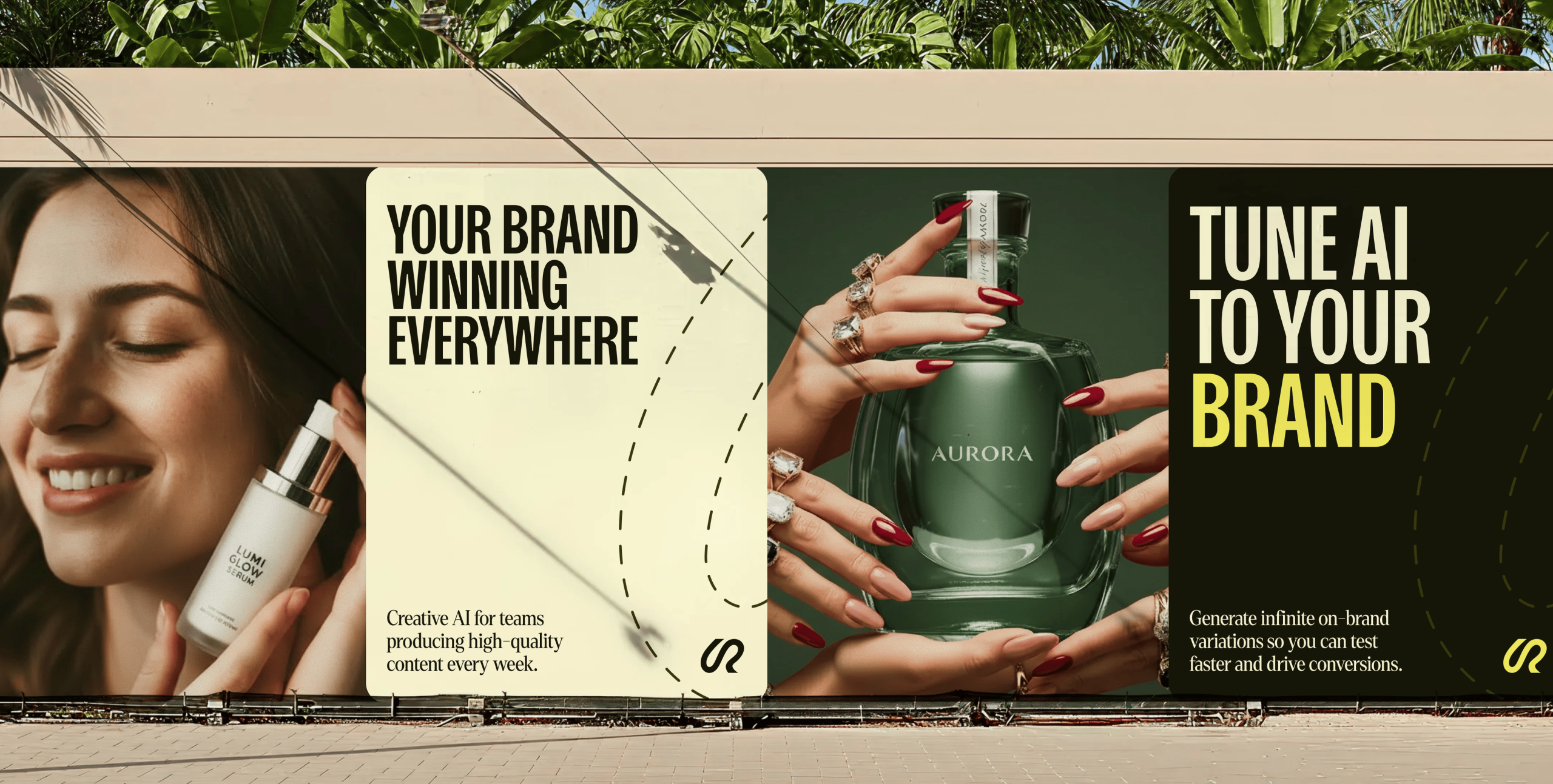
The result is a cohesive brand system: from onboarding to feature pages, every screen uses the same layout, type, and image rules. Riverflow now shows up as the AI partner for serious teams — the place you go to tune AI to your brand and ship iconic, on‑brand visuals for every campaign.